Data Analysis panel


Data Analysis panel |
|
|
The Data Analysis panel contains several options to create your graphs. You can import a .txt or .csv file (via File/Open dialog of Mnova) to fill the Data Analysis panel with X,Y values and generate the applicable graphical representation.
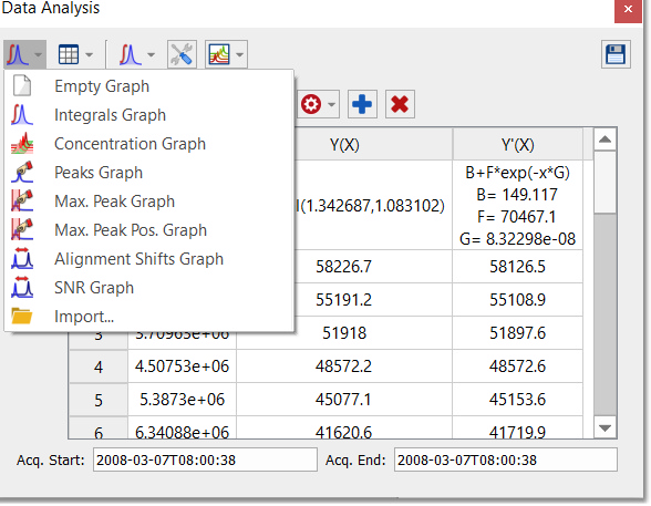
You can select any graph from the scroll down menu below (and then a region of interest in the arrayed spectrum):
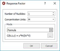
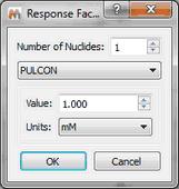
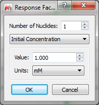
If you select the Concentration Graph, a new dialog box will appear to ask you for the number of nuclides of the selected region
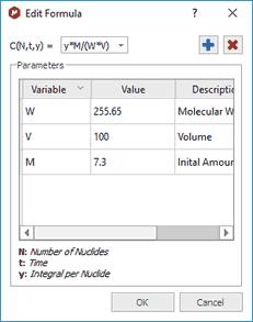
Click on the 3 dots button to customize the formula:
The terms in the equation and table are as follows: N=Number of nuclides W = molecular weight of chemical species (g/mole) M = initial amount, or mass V = volume
So if M is in grams, and V is in litres, then the equation calculates concentration in Molar. (Obviously the user can introduce factors to convert this to mM or whatever is convenient).
With the 'Reaction Monitoring' plugin enabled you will be able to select 'PULCON' or 'Initial Concentration' modes:
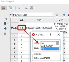
NOTE: If the X column in Data Analysis is filled with zeros or you need to change the function, just double click on the model cell to derive t' not only from t but also from i-spectrum index:
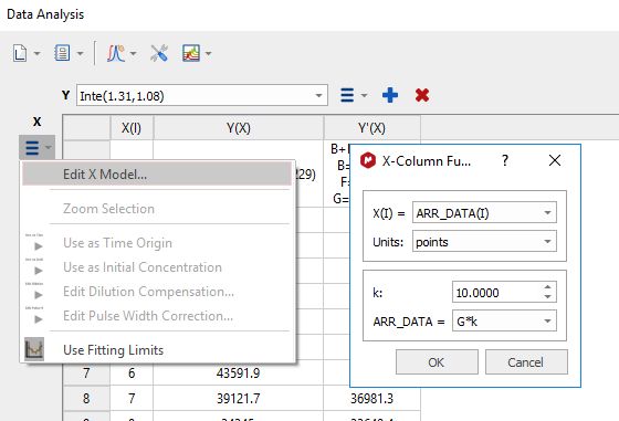
From the same dialog (or by selecting 'Edit X Model'), you can also change the time units and setting the k and ARR_DATA values:
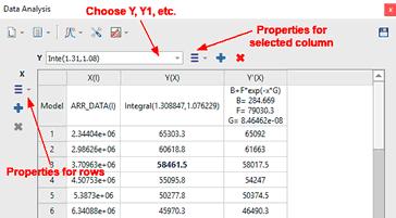
Copy the values from an an Excel worksheet and paste them into the X(I) column by highlight the first cell (in the row 1) and doing ‘Ctrl/Cmd+V’ to paste the values.
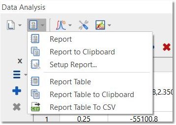
Clicking on the Report scroll down menu, will paste the report or the table to your spectrum, to the clipboard or to a csv file:
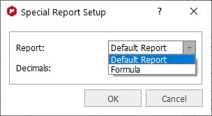
Selecting the Setup Report option, will allow you to paste only the formula or the default reportt:
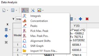
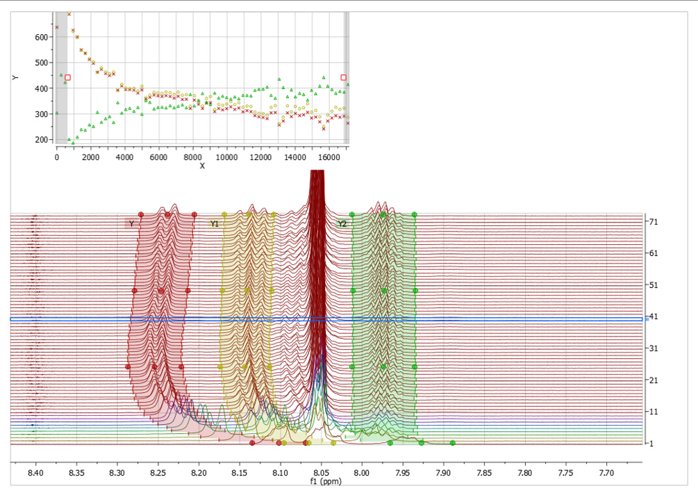
Clicking on the 'Interactive Y Filling' scroll down menu will allow you to select between different peaks selection modes (Peak Integrals, Concentrations, Intensities, or Maximum Peak Intensity, Alignment shifts, SNR Graph or import YY' File), in order to generate the applicable plot.
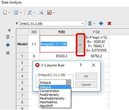
Please note that you can also change those options by double clicking on the '...' button of the Model cell under the Y(X) header of the Data Analysis panel:
The 'Alignment shift' option will measure the change of chemical shift of the peak across the spectra, after having used the Alignment algorithm to align the peaks of interest.
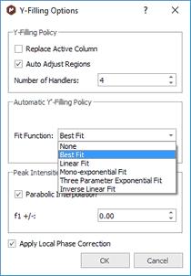
Clicking on the 'Edit Model Options' button, will allow you to change some defaults, such as the capability to replace the active column (or to create a new one); number of handles of the selected regions, the Fit function for the Y'-Filling column or use a 'Parabolic Interpolation for the 'Peak intensities'.
The 'auto adjust regions' option will automatically track the 'move' of the peaks/multiplets through the time course of a reaction.
See this blog entry for the 'auto adjust regions' feature: http://mestrelab.com/blog/automatic-peak-tracking-in-arrayed-nmr-data/
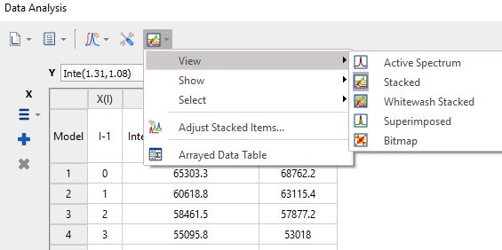
In this panel; you will also find a button ("Reaction Monitoring") which contains all Show and Select options from Stacked Items table, and options to show/hide Stacked Spectra and Arrayed Data tables. The button is only visible when RM plugin is installed and licensed:
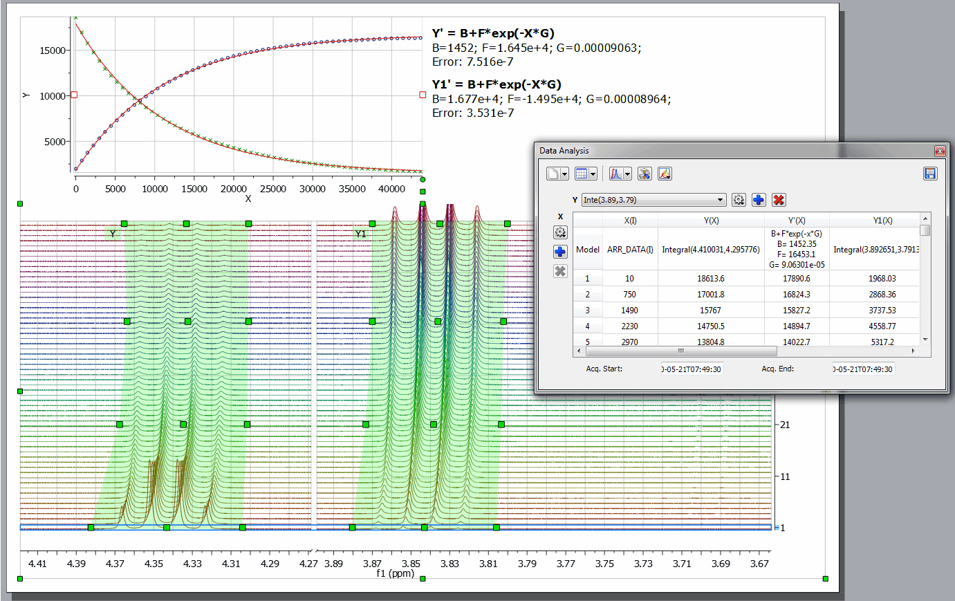
You can add additional curves to the representation by clicking on the 'Add New Data Serie' icon
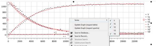
Right clicking on the Data Analysis Graphic, will allow you to update the graph after having made changes in the series of the 'Data Analysis Table' or directly on the stacked spectra (very useful, for example if you invert the order of the spectra). If you have more than one curve, you will be able to select/deselect available "series" (curves) on the plot. Follow the menu 'Processing/Blind Regions/Add Blind Regions' to add blind regions to your arrayed experiment. |